The challenge
In Pori, things are done a bit differently. It's a city that takes pride in its unique oddity and doesn't hesitate to swim against the current. So naturally, in the year 2024, City of Pori decided to establish a print magazine.
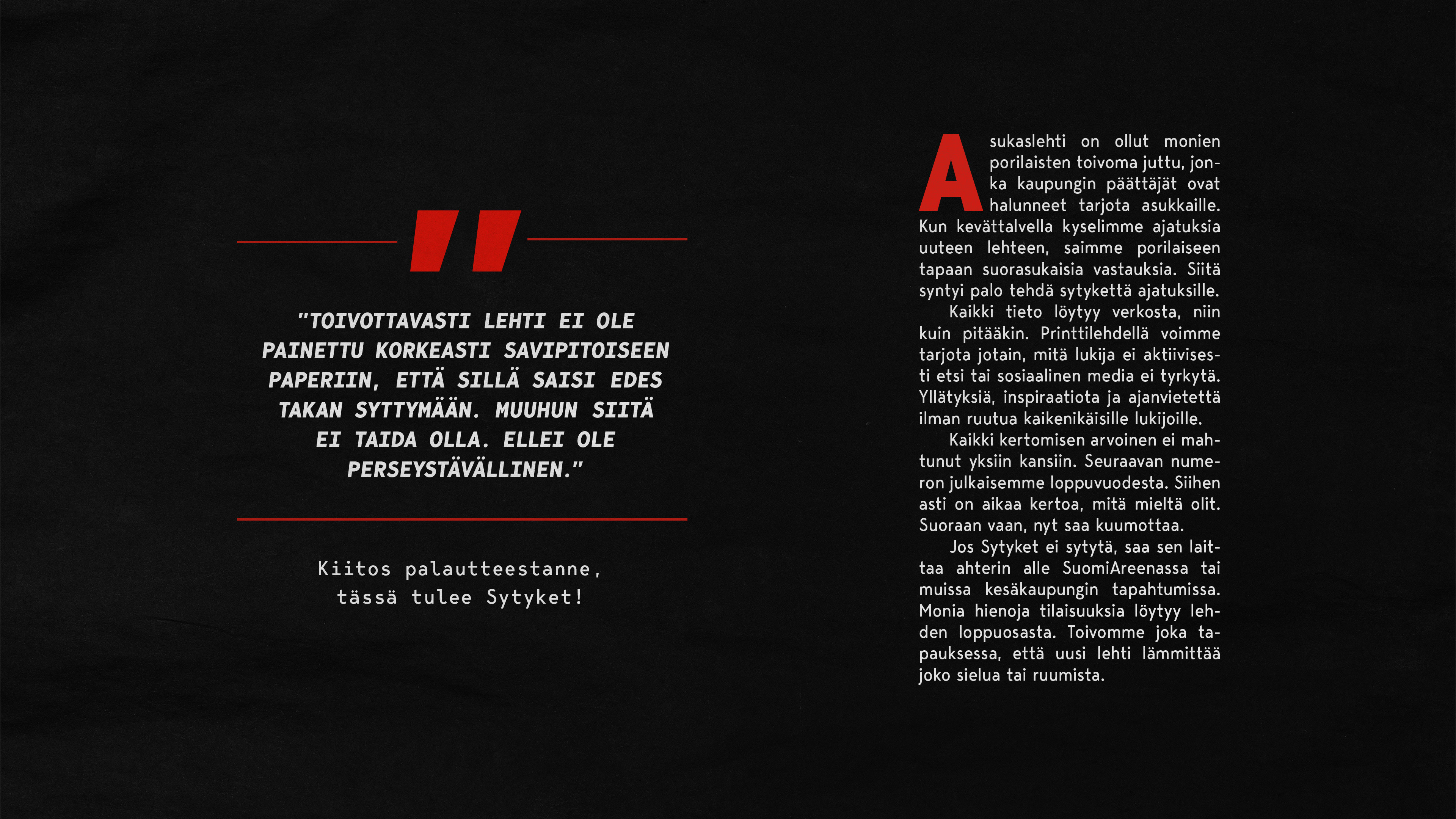
People of Pori have an infamously skeptical and slightly cynical worldview. So, when City of Pori inquired its residents about their hopes for the forthcoming residents' magazine, positive feedback was hard to find while criticism plentiful. In today's world, where information becomes outdated fast, what's the use for a print publication? One remark in particular amused us, as it epitomized perfectly the mental landscape of Pori:
"I hope the magazine isn't printed on paper with a high clay volume, so it could be used as tinder to light up a fireplace. I really don't see any other use for it [the magazine]."
- Anonymous citizen of Pori
To actually produce added value for the residents of Pori, the publication needed to have a genuinely interesting concept that even the tough crowd of Pori would embrace.
The solution
It goes without saying that the magazine would have to highlight the positive things happening in Pori. Pori residents, however, are not easily charmed and wouldn't tolerate pretentiousness, excessive self-praise or things being sugarcoated.
What sets a Pori resident's soul on fire is authenticity.
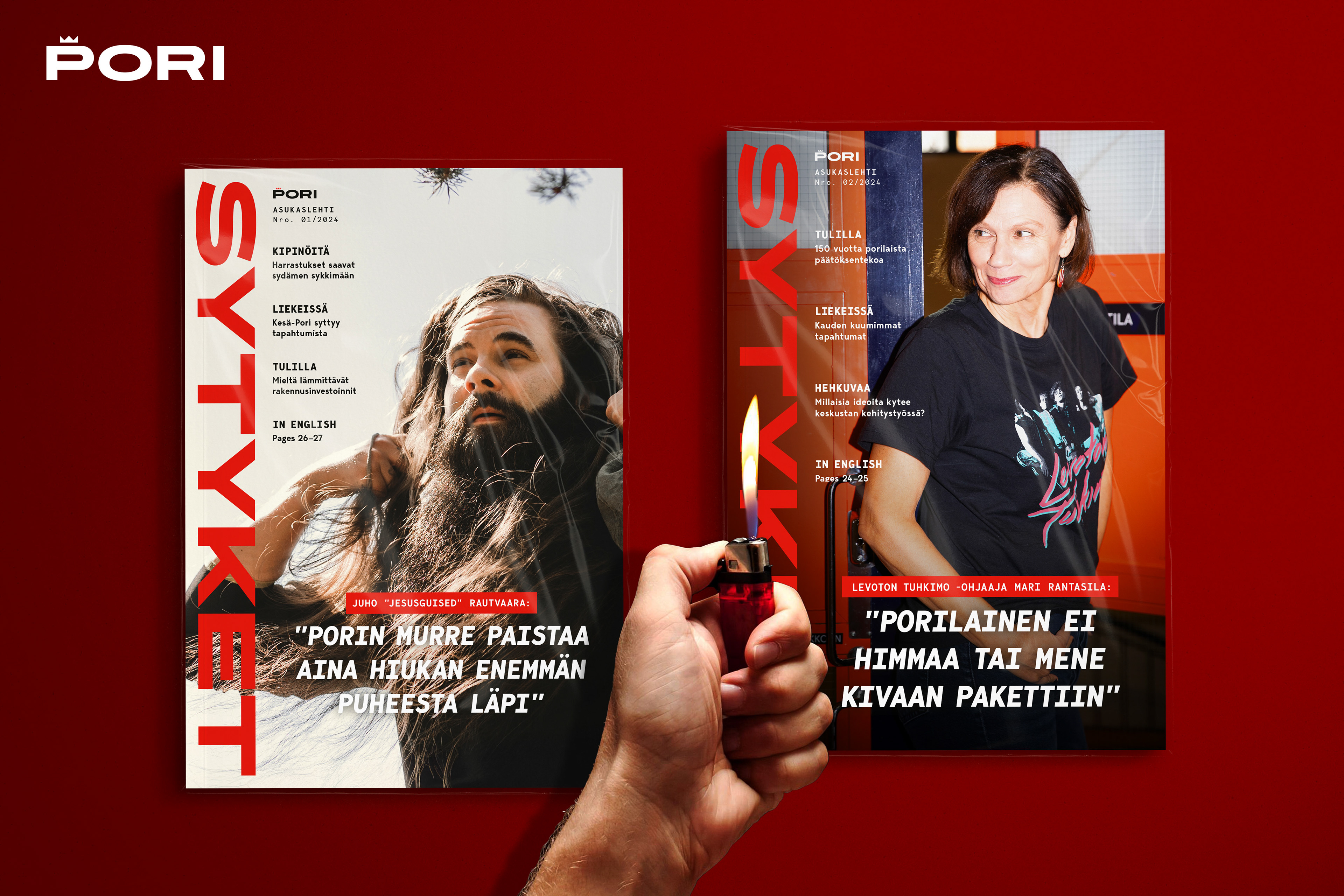
Our solution was a magazine that tackles cynical prejudices with bold self-irony and stands out from the local media with original perspectives, topics, look and tone. A magazine, that isn't afraid to bring the heat. Inspired by a resident's straightforward criticism, the magazine was named Sytyket (transl. "tinder"), and even the paper was chosen accordingly (yes, it's fireplace-friendly).
Visually, the magazine stayed true to City of Pori's brand (ie. typefaces & primary colors), but also drew inspiration from respected quality magazines, most notably Image. After all, we were making a magazine with attitude, not your average town publication. Design-wise it is very streamlined and favours hard shapes over soft ones – fitting for a non-bullshit magazine like Sytyket.
It is very, very Pori.
Team
Creative Director
Iina Ratinen
Art Director
Smuel Stiller
Senior Creative / Copywriter
Sari Kelkka
Strategic Planner
Mira Järvelä
Editor
Minna Heikkilä (City of Pori)
Photography (cover stories)
Mikael Leppäniemi
Veera Korhonen