The challenge
Vepe and ICEPRO, combined their ice rink and other sports related businesses together in June 2023. This made the new company, Vepe-Icepro, the biggest ice hockey dasherboard manufacturer in all of Europe. The company's pioneering product is the LED 360° dasherboard, which covers the whole rink with LED screens. The ambition is to make this innovation the new standard for all professional hockey not only in Europe, but in North America too.
Vepe-Icepro needed a strategy and an internationally credible brand identity to reach the next level. The wish was to retain "a little something" from both brands' former visual identities, which was challenging since both of them were visually outdated. The final product would have to be a fresh, modern look that would stand the test of time, while staying true to what the new brand stands for:
Brand attributes
Forerunner / Experimental / Reliable
Differentiating factors
Innovativeness / One-stop service /
Problem solving approach
The solution
A new brand identity was crafted to match the company's international ambitions and to better convince the main target groups defined in the strategy work: the executives of sports arena facilities and the GM's of professional hockey teams.
This guided the design of the visual identity and tonality of the new brand. So much so, that even product names were refined and color coded to further communicate the technical expertise of the company.
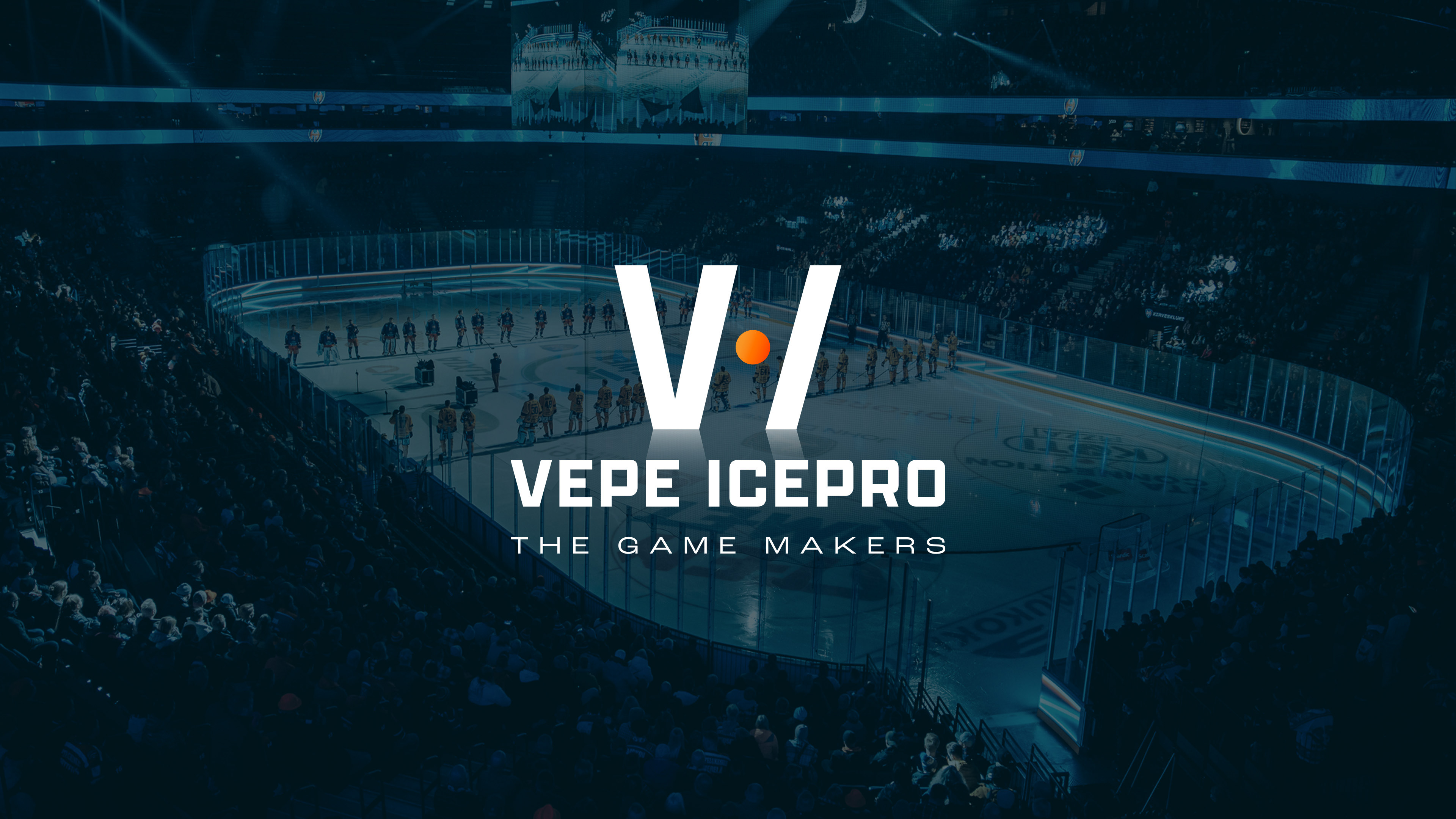
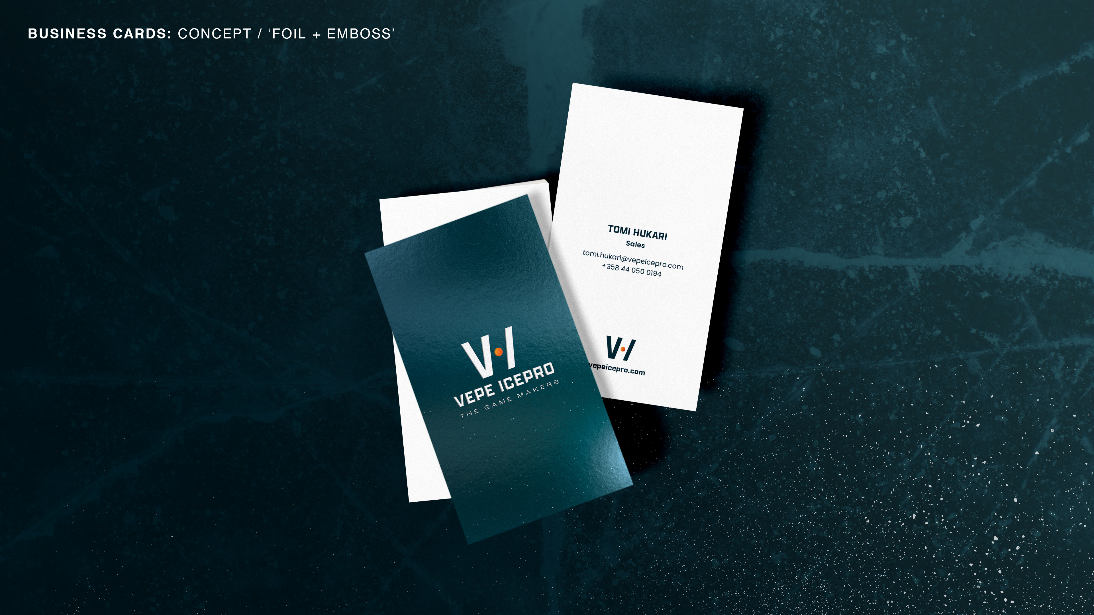
Vepe-Icepro were proclaimed as The Game Makers, the innovative and passionate providers for the game of hockey (and other ice sports). On a mission to elevate the game experience for both the players and the audiences, Vepe-Icepro leads the industry with technical innovation and state-of-the-art setting for ice sports.
Vepe-Icepro were proclaimed as The Game Makers, the innovative and passionate providers for the game of hockey (and other ice sports). On a mission to elevate the game experience for both the players and the audiences, Vepe-Icepro leads the industry with technical innovation and state-of-the-art setting for ice sports.
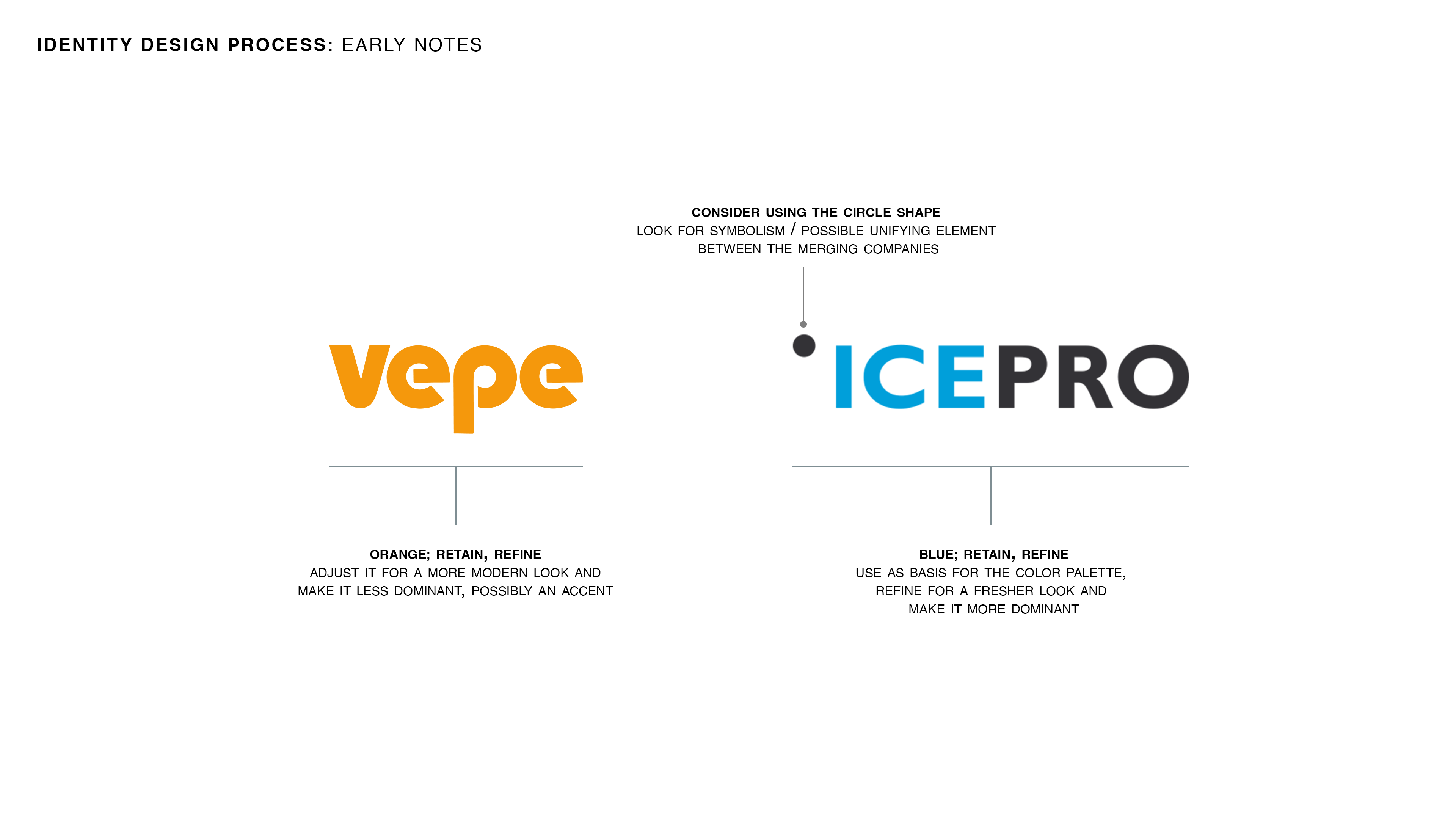


The new brandmark was formed using the company's initials and by taking inspiration from the shape of a hockey rink.

The new color palette used both brands' former primary colors as basis and took inspiration from the element of ice. The primary colors were refined to create a more dynamic and modern look. In addition, two color gradients were constructed to further communicate the company's technical and innovative expertise.
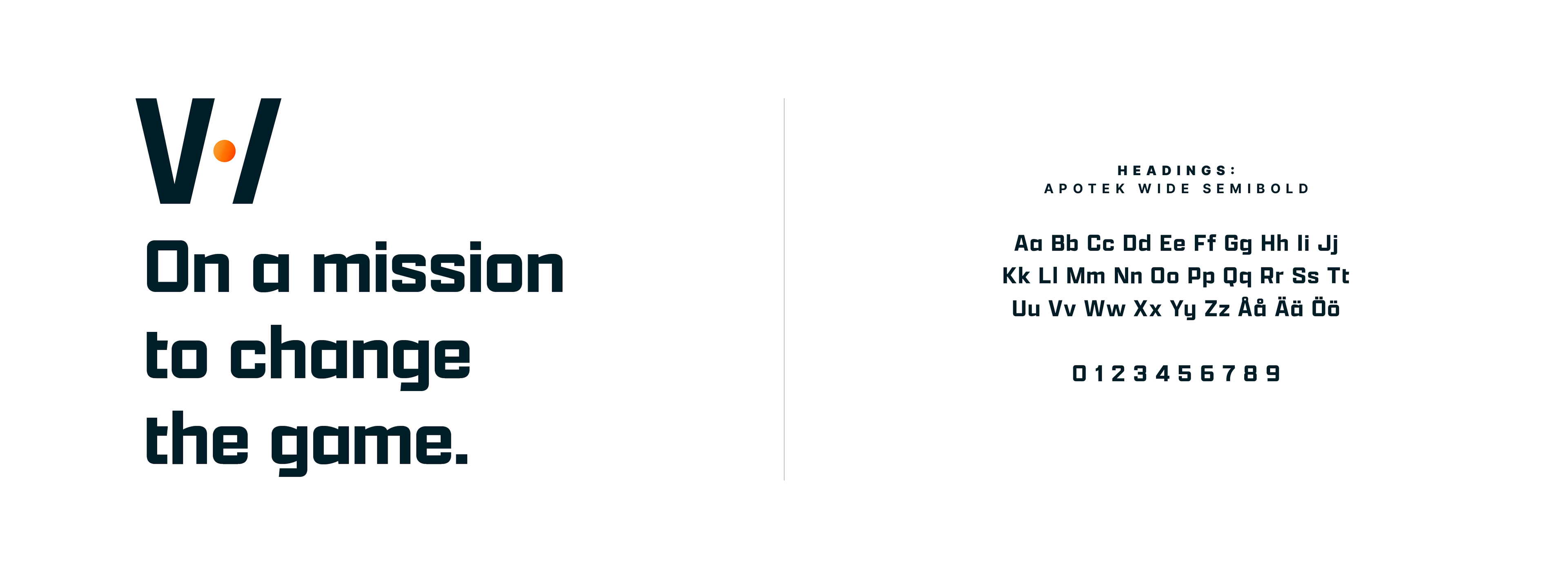

The brand typography was formed with two typefaces. Apotek was chosen as the typeface for headings for its clean, geometric shapes, distinctive look and modern feel. Different weights of Poppins, a contemporary typeface, were chosen for both subheadings and body text.
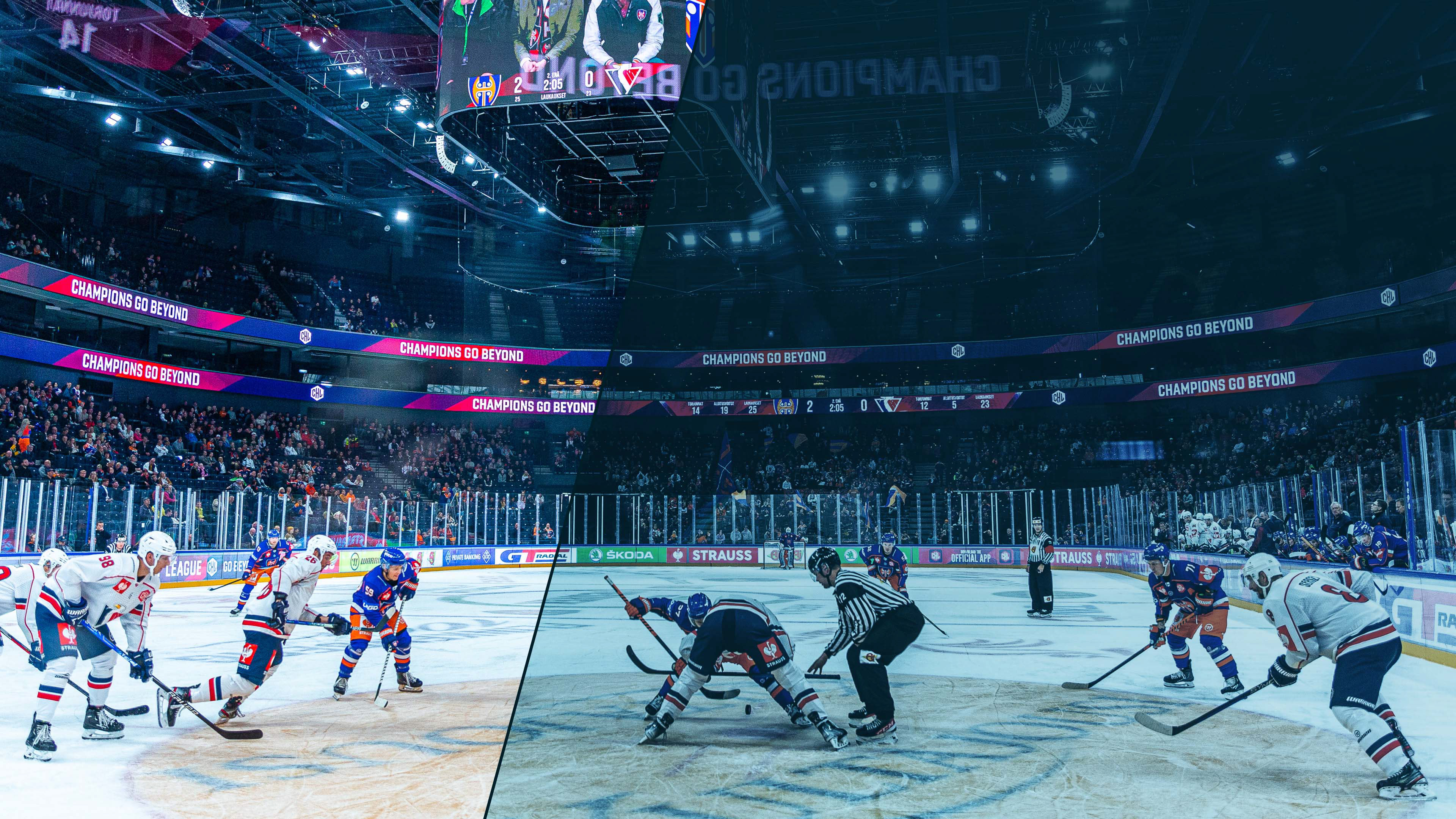
Keeping it cool. Brand imagery was toned to blue and retouched for a cohesive look.

Team
Art Director & UI / UX
Smuel Stiller
Smuel Stiller
Senior Creative / Copywriter
Jukka Juhola
Jukka Juhola
Business Designer
Aleksi Lehtonen
Aleksi Lehtonen
Motion Designer
Jukka Päivinen
Jukka Päivinen
Web Development
Haven Porvoo
Haven Porvoo